1. Web Components, Shadow DOM, template
1.1. Web components
bundle markup and styles into custom HTML elements. They fully encapsulate all of their HTML and CSS. That means the styles that you write always render as you intended, and your HTML is safe from the prying eyes of external JavaScript.
1.2. Image Slider example
Think about how you currently implement an image slider, it might look something like this:
<div id="slider">
  <input checked="" type="radio" name="slider" id="slide1" selected="false">
  <input type="radio" name="slider" id="slide2" selected="false">
  <input type="radio" name="slider" id="slide3" selected="false">
  <input type="radio" name="slider" id="slide4" selected="false">
  <div id="slides">
    <div id="overflow">
      <div class="inner">
        <img src="images/rock.jpg">
        <img src="images/grooves.jpg">
        <img src="images/arch.jpg">
        <img src="images/sunset.jpg">
      </div>
    </div>
  </div>
  <label for="slide1"></label>
  <label for="slide2"></label>
  <label for="slide3"></label>
  <label for="slide4"></label>
</div>
We want it to be something like:
<img-slider>
  <img src="images/sunset.jpg" alt="a dramatic sunset">
  <img src="images/arch.jpg" alt="a rock arch">
  <img src="images/grooves.jpg" alt="some neat grooves">
  <img src="images/rock.jpg" alt="an interesting rock">
</img-slider>
1.2.1. Shadow DOM
Think of <video> tag:
<video controls autoplay name="media" width="500">
    <source src="http://7ryl2t.com2.z0.glb.qiniucdn.com/572ffc37a2e5a.mp4">
</video>
为什么写个 video 就能能看到 开始、音量调节 等按钮?他们存放在 shadow dom 中
There's a play button, a scrubber, timecodes and a volume slider. Lots of stuff that you didn't have to write any markup for, it just appeared when you asked for <video>.
But what you're actually seeing is an illusion. The browser makers needed a way to guarantee that the tags they implemented would always render the same, regardless of any wacky HTML, CSS or JavaScript we might already have on the page. To do this, they created a secret passageway where they could hide their code and keep it out of our hot little hands. They called this secret place: the Shadow DOM.
Use Chrome Developer Tools and enable the Show user agent shadow DOM flag. That'll let you inspect the <video> element in more detail.

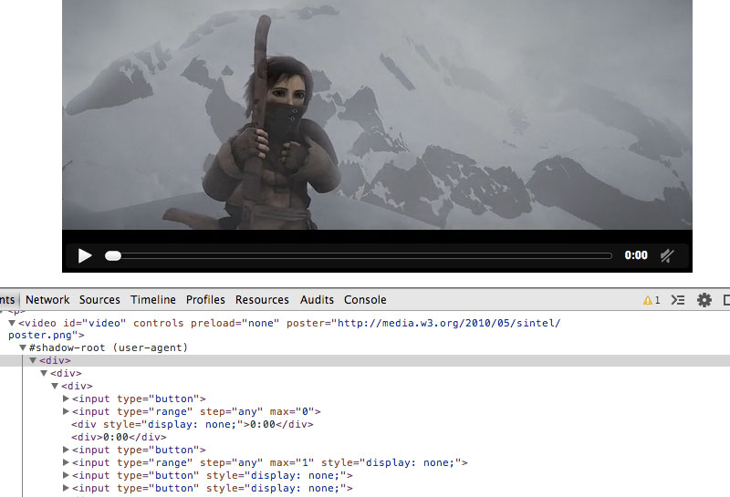
Inside you'll find that there's a ton of HTML all hidden away.
So how to use our custom <img-slider> tag like <video>?
1.2.2. Templates
<template>
  <h1>Hello there!</h1>
  <p>This content is top secret :)</p>
</template>
Everything inside a template is considered inert by the browser. This means tags with external sources — <img>, <audio>, <video>, etc. — do not make http requests and <script> tags do not execute. It also means that nothing from within the template is rendered on the page until we activate it using JavaScript.
So the first step in creating our <img-slider> is to put all of its HTML and CSS into a <template>.
Once we've done this, we're ready to move it into the shadow DOM.
1.2.3. Shadow DOM
To create shadow DOM, select an element and call its createShadowRoot method. This will return a document fragment which you can then fill with content.
<div class="container"></div>

<script>
  var host = document.querySelector('.container');
  var root = host.createShadowRoot();
  root.innerHTML = '<p>How <em>you</em> doing?</p>'
</script>
Shadow Host
In shadow DOM parlance, the element that you call createShadowRoot on is known as the Shadow Host. It's the only piece visible to the user, and it's where you would ask the user to supply your element with content.
If you think about our <video> tag from before, the <video>element itself is the shadow host, and the contents are the tags you nest inside of it.
<video>
  <source src="trailer.mp4" type="video/mp4">
  <source src="trailer.webm" type="video/webm">
  <source src="trailer.ogv" type="video/ogg">
</video>
Shadow Root
The document fragment returned by createShadowRoot is known as the Shadow Root. The shadow root, and its descendants, are hidden from the user, but they're what the browser will actually render when it sees our tag.
In the <video> example, the play button, scrubber, timecode, etc. are all descendants of the shadow root. They show up on the screen but their markup is not visible to the user.
Shadow Boundary
Any HTML and CSS inside of the shadow root is protected from the parent document by an invisible barrier called the Shadow Boundary. The shadow boundary prevents CSS in the parent document from bleeding into the shadow DOM, and it also prevents external JavaScript from traversing into the shadow root.
Translation: Let's say you have a style tag in the shadow DOM that specifies all h3's should have a color of red. Meanwhile, in the parent document, you have a style that specifies h3's should have a color of blue. In this instance, h3's appearing within the shadow DOM will be red, and h3's outside of the shadow DOM will be blue. The two styles will happily ignore each other thanks to our friend, the shadow boundary.
And if, at some point, the parent document goes looking for h3's with $('h3'), the shadow boundary will prevent any exploration into the shadow root and the selection will only return h3's that are external to the shadow DOM.
1.2.4. Shadowy Sliders
To get our img-slider into the shadow DOM we'll need to create a shadow host and populate it with the contents of our template.
<template>
  <style>
    * {
      -webkit-box-sizing: border-box;
      -moz-box-sizing: border-box;
      -ms-box-sizing: border-box;
      box-sizing: border-box;
    }

    #slider {
      max-width: 600px;
      text-align: center;
      margin: 0 auto;
    }

    #overflow {
      width: 100%;
      overflow: hidden;
    }

    #slides .inner {
      width: 400%;
    }

    #slides .inner {
      -webkit-transform: translateZ(0);
      -moz-transform: translateZ(0);
      -o-transform: translateZ(0);
      -ms-transform: translateZ(0);
      transform: translateZ(0);

      -webkit-transition: all 800ms cubic-bezier(0.770, 0.000, 0.175, 1.000);
      -moz-transition: all 800ms cubic-bezier(0.770, 0.000, 0.175, 1.000);
      -o-transition: all 800ms cubic-bezier(0.770, 0.000, 0.175, 1.000);
      -ms-transition: all 800ms cubic-bezier(0.770, 0.000, 0.175, 1.000);
      transition: all 800ms cubic-bezier(0.770, 0.000, 0.175, 1.000);

      -webkit-transition-timing-function: cubic-bezier(0.770, 0.000, 0.175, 1.000);
      -moz-transition-timing-function: cubic-bezier(0.770, 0.000, 0.175, 1.000);
      -o-transition-timing-function: cubic-bezier(0.770, 0.000, 0.175, 1.000);
      -ms-transition-timing-function: cubic-bezier(0.770, 0.000, 0.175, 1.000);
      transition-timing-function: cubic-bezier(0.770, 0.000, 0.175, 1.000);
    }

    #slides img {
      width: 25%;
      float: left;
    }

    #slide1:checked ~ #slides .inner {
      margin-left: 0;
    }

    #slide2:checked ~ #slides .inner {
      margin-left: -100%;
    }

    #slide3:checked ~ #slides .inner {
      margin-left: -200%;
    }

    #slide4:checked ~ #slides .inner {
      margin-left: -300%;
    }

    input[type="radio"] {
      display: none;
    }

    label {
      background: #CCC;
      display: inline-block;
      cursor: pointer;
      width: 10px;
      height: 10px;
      border-radius: 5px;
    }

    #slide1:checked ~ label[for="slide1"],
    #slide2:checked ~ label[for="slide2"],
    #slide3:checked ~ label[for="slide3"],
    #slide4:checked ~ label[for="slide4"] {
      background: #333;
    }
  </style>
  <div id="slider">
    <input checked="" type="radio" name="slider" id="slide1" selected="false">
    <input type="radio" name="slider" id="slide2" selected="false">
    <input type="radio" name="slider" id="slide3" selected="false">
    <input type="radio" name="slider" id="slide4" selected="false">
    <div id="slides">
      <div id="overflow">
        <div class="inner">
          <img src="https://s3-us-west-2.amazonaws.com/s.cdpn.io/5689/rock.jpg">
          <img src="https://s3-us-west-2.amazonaws.com/s.cdpn.io/5689/grooves.jpg">
          <img src="https://s3-us-west-2.amazonaws.com/s.cdpn.io/5689/arch.jpg">
          <img src="https://s3-us-west-2.amazonaws.com/s.cdpn.io/5689/sunset.jpg">
        </div> <!-- .inner -->
      </div> <!-- #overflow -->
    </div>
    <label for="slide1"></label>
    <label for="slide2"></label>
    <label for="slide3"></label>
    <label for="slide4"></label>
  </div>
</template>

<div class="img-slider"></div>

<script>
  // Add the template to the Shadow DOM
  var tmpl = document.querySelector('template');
  var host = document.querySelector('.img-slider');
  var root = host.createShadowRoot();
  root.appendChild(document.importNode(tmpl.content, true));
</script>
In this instance we've created a div and given it the class img-slider so it can act as our shadow host.
We select the template and do a deep copy of its internals with document.importNode. These internals are then appended to our newly created shadow root.
1.2.5. Insertion Points by content
At this point our img-slider is inside the shadow DOM but the image paths are hard coded. Just like the <source> tags nested inside of <video>, we'd like the images to come from the user, so we'll have to invite them over from the shadow host.
To pull items into the shadow DOM we use the new <content> tag. The <content> tag uses CSS selectors to cherry-pick elements from the shadow host and project them into the shadow DOM. These projections are known as insertion points.
We'll make it easy on ourselves and assume that the slider only contains images, that way we can create an insertion point using the img selector.
<template>
  ...
  <div class="inner">
    <content select="img"></content>
  </div>
</template>
Because we are projecting content into the Shadow DOM using an insertion point, we'll also need to use the new ::content pseudo-element to update our CSS.
#slides ::content img {
  width: 25%;
  float: left;
}
If you want to know more about the new CSS selectors and combinators added by Shadow DOM, take a look at this cheat sheet I threw together.
Now we're ready to populate our img-slider.
<div class="img-slider">
  <img src="images/rock.jpg" alt="an interesting rock">
  <img src="images/grooves.jpg" alt="some neat grooves">
  <img src="images/arch.jpg" alt="a rock arch">
  <img src="images/sunset.jpg" alt="a dramatic sunset">
</div>
final html:
<template>
  <style>
    * {
      -webkit-box-sizing: border-box;
      -moz-box-sizing: border-box;
      -ms-box-sizing: border-box;
      box-sizing: border-box;
    }

    #slider {
      max-width: 600px;
      text-align: center;
      margin: 0 auto;
    }

    #overflow {
      width: 100%;
      overflow: hidden;
    }

    #slides .inner {
      width: 400%;
    }

    #slides .inner {
      -webkit-transform: translateZ(0);
      -moz-transform: translateZ(0);
      -o-transform: translateZ(0);
      -ms-transform: translateZ(0);
      transform: translateZ(0);

      -webkit-transition: all 800ms cubic-bezier(0.770, 0.000, 0.175, 1.000);
      -moz-transition: all 800ms cubic-bezier(0.770, 0.000, 0.175, 1.000);
      -o-transition: all 800ms cubic-bezier(0.770, 0.000, 0.175, 1.000);
      -ms-transition: all 800ms cubic-bezier(0.770, 0.000, 0.175, 1.000);
      transition: all 800ms cubic-bezier(0.770, 0.000, 0.175, 1.000);

      -webkit-transition-timing-function: cubic-bezier(0.770, 0.000, 0.175, 1.000);
      -moz-transition-timing-function: cubic-bezier(0.770, 0.000, 0.175, 1.000);
      -o-transition-timing-function: cubic-bezier(0.770, 0.000, 0.175, 1.000);
      -ms-transition-timing-function: cubic-bezier(0.770, 0.000, 0.175, 1.000);
      transition-timing-function: cubic-bezier(0.770, 0.000, 0.175, 1.000);
    }

    #slides ::content img {
      width: 25%;
      float: left;
    }

    #slide1:checked ~ #slides .inner {
      margin-left: 0;
    }

    #slide2:checked ~ #slides .inner {
      margin-left: -100%;
    }

    #slide3:checked ~ #slides .inner {
      margin-left: -200%;
    }

    #slide4:checked ~ #slides .inner {
      margin-left: -300%;
    }

    input[type="radio"] {
      display: none;
    }

    label {
      background: #CCC;
      display: inline-block;
      cursor: pointer;
      width: 10px;
      height: 10px;
      border-radius: 5px;
    }

    #slide1:checked ~ label[for="slide1"],
    #slide2:checked ~ label[for="slide2"],
    #slide3:checked ~ label[for="slide3"],
    #slide4:checked ~ label[for="slide4"] {
      background: #333;
    }
  </style>
  <div id="slider">
    <input checked="" type="radio" name="slider" id="slide1" selected="false">
    <input type="radio" name="slider" id="slide2" selected="false">
    <input type="radio" name="slider" id="slide3" selected="false">
    <input type="radio" name="slider" id="slide4" selected="false">
    <div id="slides">
      <div id="overflow">
        <div class="inner">
          <content select="img"></content>
        </div> <!-- .inner -->
      </div> <!-- #overflow -->
    </div>
    <label for="slide1"></label>
    <label for="slide2"></label>
    <label for="slide3"></label>
    <label for="slide4"></label>
  </div>
</template>

<div class="img-slider">
  <img src="https://s3-us-west-2.amazonaws.com/s.cdpn.io/5689/rock.jpg">
  <img src="https://s3-us-west-2.amazonaws.com/s.cdpn.io/5689/grooves.jpg">
  <img src="https://s3-us-west-2.amazonaws.com/s.cdpn.io/5689/arch.jpg">
  <img src="https://s3-us-west-2.amazonaws.com/s.cdpn.io/5689/sunset.jpg">
</div>

<script>
  // Polyfill support
  HTMLElement.prototype.createShadowRoot =
    HTMLElement.prototype.createShadowRoot ||
    HTMLElement.prototype.webkitCreateShadowRoot ||
    function() {};

  // Add the template to the Shadow DOM
  var tmpl = document.querySelector('template');
  var host = document.querySelector('.img-slider');
  var root = host.createShadowRoot();
  root.appendChild(document.importNode(tmpl.content, true));
</script>
Next, we can turn this img-slider div into its own tag.
1.2.6. Custom Elements
A Custom Element two requirements:
- name must contain a dash
- prototype must extend
HTMLElement
<template>
  <!-- Full of image slider awesomeness -->
</template>

<script>
  // Grab our template full of slider markup and styles
  var tmpl = document.querySelector('template');

  // Create a prototype for a new element that extends HTMLElement
  var ImgSliderProto = Object.create(HTMLElement.prototype);

  // Setup our Shadow DOM and clone the template
  ImgSliderProto.createdCallback = function() {
    var root = this.createShadowRoot();
    root.appendChild(document.importNode(tmpl.content, true));
  };

  // Register our new element
  var ImgSlider = document.registerElement('img-slider', {
    prototype: ImgSliderProto
  });
</script>
The Object.create method returns a new prototype which extends HTMLElement. When the parser finds our tag in the document it will check to see if it has a method named createdCallback. If it finds this method it will run it immediately. This is a good place to do setup work, so we create some Shadow DOM and clone our template into it.
We pass the tag name and prototype to a new method on the document, called registerElement, and after that we're ready to go.
Now that our element is registered there are a few different ways to use it. The first, and most straightforward, is to just use the <img-slider> tag somewhere in our HTML. But we can also call document.createElement("img-slider") or we can use the constructor that was returned by document.registerElement and stored in the ImgSlider variable. It's up to you which style you prefer.
Final:
<template>
  <style>
    * {
      -webkit-box-sizing: border-box;
      -moz-box-sizing: border-box;
      -ms-box-sizing: border-box;
      box-sizing: border-box;
    }

    #slider {
      max-width: 600px;
      text-align: center;
      margin: 0 auto;
    }

    #overflow {
      width: 100%;
      overflow: hidden;
    }

    #slides .inner {
      width: 400%;
    }

    #slides .inner {
      -webkit-transform: translateZ(0);
      -moz-transform: translateZ(0);
      -o-transform: translateZ(0);
      -ms-transform: translateZ(0);
      transform: translateZ(0);

      -webkit-transition: all 800ms cubic-bezier(0.770, 0.000, 0.175, 1.000);
      -moz-transition: all 800ms cubic-bezier(0.770, 0.000, 0.175, 1.000);
      -o-transition: all 800ms cubic-bezier(0.770, 0.000, 0.175, 1.000);
      -ms-transition: all 800ms cubic-bezier(0.770, 0.000, 0.175, 1.000);
      transition: all 800ms cubic-bezier(0.770, 0.000, 0.175, 1.000);

      -webkit-transition-timing-function: cubic-bezier(0.770, 0.000, 0.175, 1.000);
      -moz-transition-timing-function: cubic-bezier(0.770, 0.000, 0.175, 1.000);
      -o-transition-timing-function: cubic-bezier(0.770, 0.000, 0.175, 1.000);
      -ms-transition-timing-function: cubic-bezier(0.770, 0.000, 0.175, 1.000);
      transition-timing-function: cubic-bezier(0.770, 0.000, 0.175, 1.000);
    }

    #slides ::content img {
      width: 25%;
      float: left;
    }

    #slide1:checked ~ #slides .inner {
      margin-left: 0;
    }

    #slide2:checked ~ #slides .inner {
      margin-left: -100%;
    }

    #slide3:checked ~ #slides .inner {
      margin-left: -200%;
    }

    #slide4:checked ~ #slides .inner {
      margin-left: -300%;
    }

    input[type="radio"] {
      display: none;
    }

    label {
      background: #CCC;
      display: inline-block;
      cursor: pointer;
      width: 10px;
      height: 10px;
      border-radius: 5px;
    }

    #slide1:checked ~ label[for="slide1"],
    #slide2:checked ~ label[for="slide2"],
    #slide3:checked ~ label[for="slide3"],
    #slide4:checked ~ label[for="slide4"] {
      background: #333;
    }
  </style>
  <div id="slider">
    <input checked="" type="radio" name="slider" id="slide1" selected="false">
    <input type="radio" name="slider" id="slide2" selected="false">
    <input type="radio" name="slider" id="slide3" selected="false">
    <input type="radio" name="slider" id="slide4" selected="false">
    <div id="slides">
      <div id="overflow">
        <div class="inner">
          <content select="img"></content>
        </div> <!-- .inner -->
      </div> <!-- #overflow -->
    </div>
    <label for="slide1"></label>
    <label for="slide2"></label>
    <label for="slide3"></label>
    <label for="slide4"></label>
  </div>
</template>

<img-slider>
  <img src="https://s3-us-west-2.amazonaws.com/s.cdpn.io/5689/rock.jpg">
  <img src="https://s3-us-west-2.amazonaws.com/s.cdpn.io/5689/grooves.jpg">
  <img src="https://s3-us-west-2.amazonaws.com/s.cdpn.io/5689/arch.jpg">
  <img src="https://s3-us-west-2.amazonaws.com/s.cdpn.io/5689/sunset.jpg">
</img-slider>
// Polyfill support
HTMLElement.prototype.createShadowRoot =
  HTMLElement.prototype.createShadowRoot ||
  HTMLElement.prototype.webkitCreateShadowRoot ||
  function() {};

// Grab our template full of slider markup and styles
var tmpl = document.querySelector('template');

// Create a prototype for a new element that extends HTMLElement
var ImgSliderProto = Object.create(HTMLElement.prototype);

// Setup our Shadow DOM and clone the template
ImgSliderProto.createdCallback = function() {
  var root = this.createShadowRoot();
  root.appendChild(document.importNode(tmpl.content, true));
};

// Register our new element
var ImgSlider = document.registerElement('img-slider', {
  prototype: ImgSliderProto,
});
1.2.7. Polymer
Let's look at how we could rewrite our img-slider using Google's Web Component library, Polymer.
Polymer adds a new tag to the browser, <polymer-element>, which automagically turns templates into shadow DOM and registers custom elements for us. All we need to do is to tell Polymer what name to use for the tag and to make sure we include our template markup.
I find it's often easier to create elements using Polymer because of all the niceties built into the library. This includes two-way binding between elements and models, automatic node finding and support for other new standards like Web Animations. Also, the developers on the polymer-dev mailing list are extremely active and helpful, which is great when you're first learning the ropes, and the StackOverflow community is growing.
This is just a tiny example of what Polymer can do, so be sure to visit its project page and also checkout Mozilla's alternative, X-Tag.
1.2.8. SEO
At this moment it's unclear how well crawlers support Custom Elements and Shadow DOM. The Polymer FAQ states:
Search engines have been dealing with heavy AJAX based application for some time now. Moving away from JS and being more declarative is a good thing and will generally make things better.
The Google Webmaster's blog recently announced that the Google crawler will execute JavaScript on your page before indexing it. And using a tool like Fetch as Google will allow you to see what the crawler sees as it parses your site. A good example is the Polymer website, which is built with custom elements and is easily searched in Google.
One tip I've learned from speaking with members of the Polymer team is to try to make sure the content inside of your custom element is static, and not coming from a data binding.
<!-- probably good -->
<x-foo>
  Here is some interesting, and searchable content...
</x-foo>

<!-- probably bad -->
<x-foo>
  {{crazyDynamicContent}}
</x-foo>

<!-- also probably bad -->
<a href="{{aDynamicLink}}">Click here</a>
To be fair, this isn't a new problem. AJAX heavy sites have been dealing with this issue for a few years now and thankfully there are solutions out there.
1.2.9. Accessibility
Obviously when you're hiding markup in secret shadow DOM sandboxes the issue of accessibility becomes pretty important. Steve Faulkner took a look at accessibility in shadow DOM and seemed to be satisfied with what he found.
Results from initial testing indicate that inclusion of ARIA roles, states and properties in content wholly inside the Shadow DOM works fine. The accessibility information is exposed correctly via the accessibility API. Screen readers can access content in the Shadow DOM without issue.
The full post is available here.
Marcy Sutton has also written a post exploring this topic in which she explains:
Web Components, including Shadow DOM, are accessible because assistive technologies encounter pages as rendered, meaning the entire document is read as “one happy tree”.
Marcy also points out that the img-slider I built in this post is not accessible because our css label trick makes it inaccessible from the keyboard. Keep that in mind if you're looking to reuse it in a project.
Surely there will be bumps along the way but that sounds like a pretty great start!
1.2.10. Style tags? Um, no thanks.
Unfortunately <link> tags do not work inside of the Shadow DOM, which means the only way to pull in external CSS is through @import. In other words, <style> tags are—for the moment—unavoidable.
Keep in mind that the styles we're talking about are relevant only to a component, whereas we've previously been trained to favor external files because they often affect our entire application. So is it such a bad thing to put a <style> tag inside of an element, if all of those styles are scoped just to that one entity? Personally I think it's OK, but the option of external files would be very nice to have.